
Fletcher Building –
What makes a company successful?
The people who give it their all, they are the Elements of Excellence.
The client
Fletcher Building is one of the largest employers, manufacturers, home builders, and partner on major construction and infrastructure projects in New Zealand. Fletcher Building knows that it wouldn't be what it is today if it weren't for the people giving it their all and ensuring excellence on a day-to-day basis.
To celebrate these peoples' individual achievements FB organizes a yearly awards ceremony – The Excellence Awards.
The scope
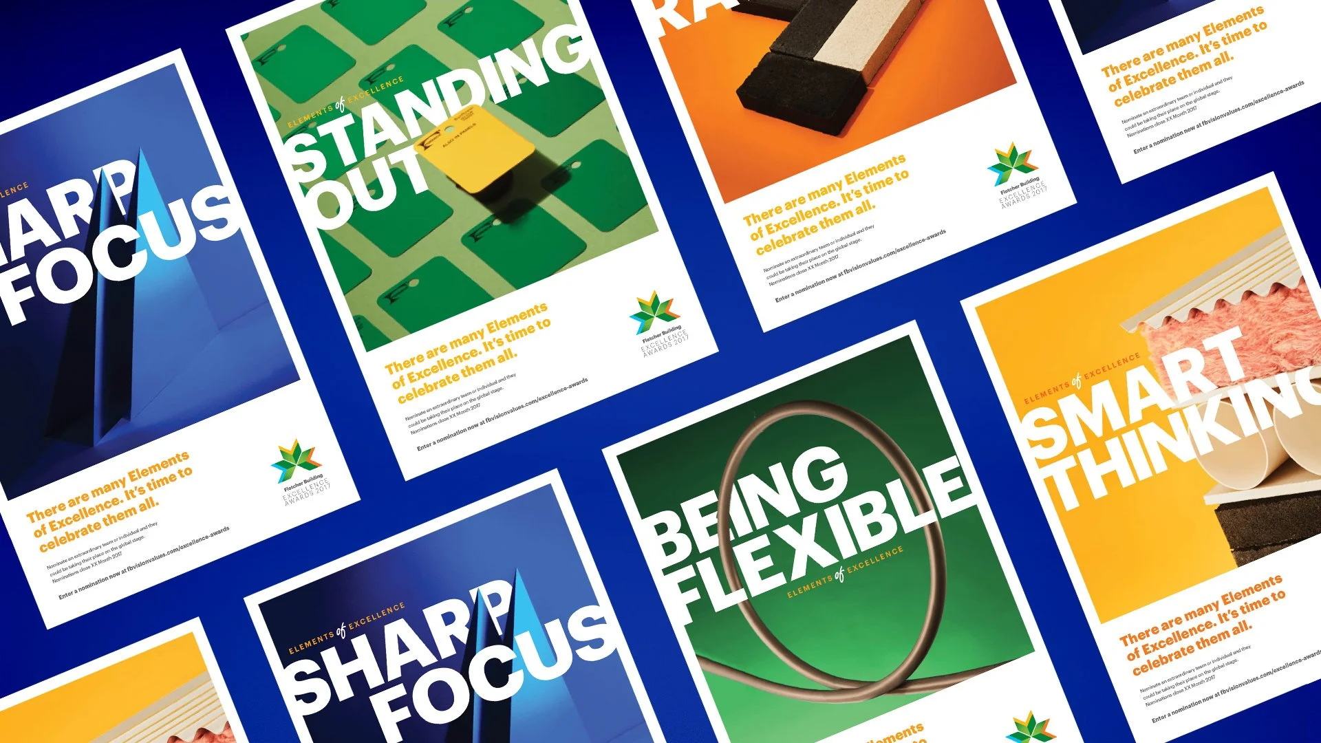
– Campaign concept
– Key visuals
– Poster series
– Webform
– Launch video


The challenge
Our objective was to develop an integrated and innovative campaign design that would pay tribute to the invaluable contributions made by Fletcher Building's employees. Additionally, we aimed to seamlessly incorporate building elements into the design to create a bridge between the brand and its core values.
The design had to be captivating, visually appealing, and instantly recognisable, while also maintaining clear and practical functionality, particularly for the webform. The focus was on creating a cohesive and strategic campaign that not only resonated with the target audience but also effectively communicated the essence of the Fletcher Building brand.


The results
The campaign was centered around five primary visuals, crafted using commonplace objects integral to the daily routine of Fletcher Building's employees. This approach created a direct visual connection between the work and the individuals responsible for it.
The campaign's design language was purposefully clear and concise, enabling it to effectively bridge the gap to Fletcher Building's core values while also celebrating the efforts of the company's workforce. This strategy was implemented with great success across multiple platforms, including print, video, and intranet webform.
The campaign's design was consistent across all platforms, enabling it to effectively convey the intended message to the target audience. The use of everyday objects in the visuals helped to establish a relatable and accessible tone, making it easy for viewers to connect with the brand and the individuals behind it.